What you’ll need to know:
HTML
CSS
Tailwind CSS
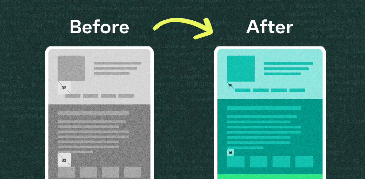
Defining the space between adjacent HTML elements is straightforward; CSS margin or padding is your best friend. Things get tricky when two full-width components are dynamically created and may have the same or different background colours. Designers generally want to maintain consistent spacing between each component, so how do you make sure the right amount of spacing is set?
We’re seeing this challenge come up often when building landing page templates that allow content editors to customize the order of components on a page. Often, these components will be designed with different themes (such as light, dark, and accent colour), each with a respective background colour. However, we discovered that spacing can be doubled when stacking two components of the same theme or background colour. To maintain consistent page spacing across all the possible template arrangements, we need to implement a CSS solution that dynamically adds space between the blocks if needed.
If you're a developer who has built components with HTML and CSS, you've probably used margins to create spacing between elements and benefited from margin collapse. An example is when two blocks are stacked together, with a margin of 50px on both the top and bottom blocks. The default CSS behaviour would collapse the margins, resulting in only 50px spacing between the blocks instead of 100px. This is a viable approach, but it doesn’t always work.
We found that some of our blocks required a background image to extend above and below the block using padding, while others only needed margins on the top and bottom. This inconsistency prevented us from relying on the default margin collapse behaviour.
While we still wanted to maintain a visual balance between the blocks, we realized the need for a fresh approach. We needed to find a way to cancel out the extra space when two blocks of the same theme were stacked together.

Building our solution
Let’s say you have a page template that requires a 50px gap between each section. When the adjacent sections have a different background colour, you want 50px of padding between the elements and the background colour edge. If the adjacent sections have the same background colour, there is a 50px gap between the sections’ elements. There are many ways to solve this, such as strict layout ordering or using JavaScript to set CSS styles dynamically. We’ve found a scalable way to handle this with CSS and HTML only: using HTML data attributes and CSS sibling selectors to set the desired spacing dynamically.
First, create a custom parent class where all the selector rules will be nested. We named ours ‘themed-block-spacing’. To make this happen with CSS, we made sure that all of our blocks were <section> tags and gave them a data attribute to track their themes, such as ‘data-blockTheme=”dark”’.
<main className="themed-block-spacing">
    <section data-blockTheme="light">
        {block content}
    </section>

    <section data-blockTheme="dark">
        {block content}
    </section>

    <section data-blockTheme="dark">
        {block content}
    </section>

    <section data-blockTheme="light">
        {block content}
    </section>
</main>
A light section with two dark sections followed by a light section
Start by creating a new CSS file, such as block-spacing.css. Then, extend the default Tailwind utilities using the @layer directive.
To refer to the parent selector (themed-block-spacing) use the & symbol. Then add an attribute selector to select all the section elements with that theme section[data-blockTheme=”dark”].
The next-sibling combinator is then used to add styles to a section immediately following a section of the same theme. So, in the case of & section[data-blockTheme="dark"] + section[data-blockTheme="dark"], we are targeting the section with a dark theme that is preceded by another section with a dark theme.
Now, you can apply additional rules when two of the same components are stacked together. Use the @apply directive to apply Tailwind’s utility classes.
@layer utilities {

  .themed-block-spacing {

    /* when 2 dark blocks in a row, remove the top padding on the second block */
    & section[data-blockTheme="dark"] + section[data-blockTheme="dark"] {
      @apply pt-0;
    }

    /* when 2 light blocks in a row, remove the top padding on the second block */
    & section[data-blockTheme="light"] + section[data-blockTheme="light"] {
      @apply pt-0;
    }

    /* when 2 grey blocks in a row, remove the top padding on the second block */
    & section[data-blockTheme="neutral"] + section[data-blockTheme="neutral"] {
      @apply pt-0;
    }
  }
}
Our Tailwind class removes the padding-top for the second section when two of the same theme are stacked.
Conclusion
Now that we’ve implemented our solution, our blocks will maintain visual balance and spacing regardless of their theme. This solution works well when there are only a few themes in your style library; otherwise, the number of rules can become difficult to manage.
In a world where content editors want the flexibility to drag and drop different types of blocks around a page, this strategy helps enforce design standards like spacing. It can also be used to customize font styles, set positioning, or deal with various sizes of background images. As layouts become more templated but still demand creativity, flexibility, and scalability, approaches like these make development fun!

