A year has passed since our team migrated from the Sketch and Zeplin combo to Figma. Our Figma adoption started with the design of an app experience and after a couple of weeks of delightful ‘Oohs’ and ‘Ahhs’, we migrated other projects to Figma. Looking into the different Figma account types, we went with ‘Figma Professional’, which made the most sense for our team size. Although our workflow still has much fine-tuning and improving to do, we wanted to share our learnings categorized into three overarching themes of things that helped us.
1. Setting up good wayfinding practices is key
In general, strategically placed signage is important because it helps direct people to where they want to go (e.g., cities, transportation systems, buildings, etc.). We’re finding that Figma files also need signage so people don’t get lost in the labyrinth of projects, files, pages and frames. Here are some things that have helped us to improve our virtual wayfinding:
Clear, concise and scannable file thumbnails
Creating custom file thumbnails help designers and teammates quickly differentiate one file from the other. An effective thumbnail can help people spend less time searching, and more time problem solving. Here’s a Figma article on how to create custom file thumbnails.
💡Two things to consider when creating these file thumbnails
Using large text so it’s legible on your team’s Figma workspace
Categorizing and visually differentiating file types (e.g., for stakeholders, discovery phase, etc.)
Ways to differentiate:
Badges - Using graphic badges to highlight specific audiences (e.g., we’ve used this ’For Review’ badge to separate stakeholder files)
Image - Using photos, illustrations and/or graphics to symbolize what’s in the file (e.g., simplified version of designs, symbols, etc.)
Colour - Using background colour, or font colour as an impactful way to visually distinguish


Simple file and frame names
When possible, keep titles for files and frames simple so they’re scannable at a quick glance, especially with several files within a project, multiple frames in a canvas, and the fact that Figma truncates longer names. Keep in mind, using the backward slash creates a nested folder when exporting frames.
It’s worth noting, there’s a newer Figma feature called ’Sections’ that became available in the Fall of 2022. We’re looking into how to integrate this into our workflow this year.


Creating custom sticky notes for documentation or references
Although Figma’s built-in comment tool helps draw attention to specific frames, our teams needed something visible and easily placed. This component would surface important information like usability requirements (e.g., max character count for form fields), interaction notes or adding live feedback during meetings with stakeholders. What made sense for our team was to create a custom sticky note component, easily accessible on the left side ’Assets’ panel.
Some projects take the custom sticky notes to the next level by colour coding them. For example:
Green - UX patterns to let the build team know (e.g., multiple error states with different messaging)
Blue - Notes from stakeholder or product owner meeting (e.g., create prototype of this flow to send this week)
Purple - Interaction notes (e.g., when the screen scrolls, please navigate to this frame linked here)
Yellow - Read me for designers for future onboarding or considerations (e.g., this screen will have to change once experience includes more provinces and territories)
Not sure how to create a component? Check out this Figma component video on YouTube.

Getting on the same page
Figma’s collaboration features have been a game changer for our hybrid team. There are many helpful ways to, sometimes quite literally, get on the same page. Here are our favourites:
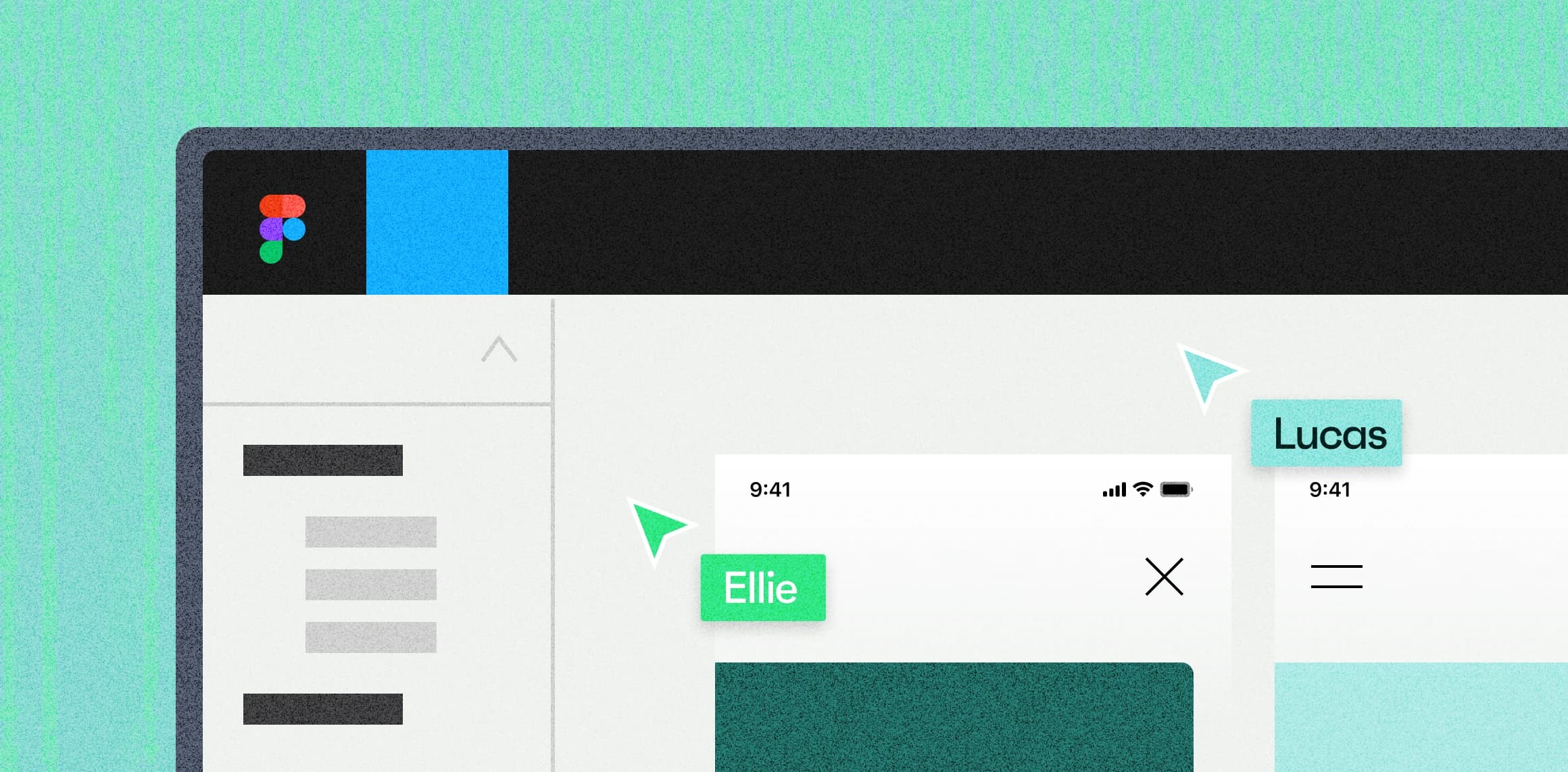
Go into Observation mode by selecting someone’s profile to follow along as they walk through the content, especially helpful with spotty internet
Linking others to:
Specific frames - Mac/PC:
⌘Cmd + L / ^Ctrl + LPrototypes - A custom sticky with the prototype linked and placed next to the designs
URLs - You can do this with URLs too
Figma comments -
Hover three dots on comment > Copy linkFigma pages -
Right click page > Copy link to pageFigma files -
Blue share button > Copy link(Please note, giving edit access changes your monthly invoice.
2. Being thoughtful with structuring the file
In Sketch, we used to have two types of files for the experiences we were building. One file for the overarching flow of the experience, and another that drilled into the details of different sections of the experience (e.g., booking, payment, sign-up, etc.).

When we moved to Figma with its seemingly unlimited file size, we experimented with combining these two. Although it was efficient in some ways, our Figma files got quite complicated. The file became intimidating for new teammates to onboard onto, and new designers felt that making simple updates became far too complicated. Some things we learned to keep in mind moving forward:
Separating Discovery, Work-In-Progress (WIP) and Build-ready flows
With the devs and QAs having live access to all the screens, we found creating separate spaces for different stages brought much needed clarity. For one of our projects, devs quickly vocalized their confusion when a screen they were working on subtly changed with no reference to what it looked like previously.
Here are some ways we divvied up the spaces:
Discovery phase - A completely different file because of it’s thrashy and innovative nature
Drawing board - A separate Figma page to put our ’Work-in-progress’ screens to separate from what’s ’Build-ready’
Build-ready - After meeting with the build team and getting on the same page, we move experiences to these pages
What we’re looking to improve on is structuring the Figma pages so devs and QAs could intuitively reference previous designs to compare if needed.

Create multiple spots for inspiration and design references
While working on a project, our teams often refer to other experiences in the wild to break down what they’re doing and take those learnings to improve what we’re building. Finding ways to communicate and share these learnings, and getting everyone on the same wavelength to collaborate has been key for us. This can range from deconstructing overall user flows like shopping cart experiences, to dissecting interactions like coupon code fields, to observing and appreciating how people translate brands into various experiences.
Some things that helped us:
Having a designated ’Reference’ page for current and new designers to go to
Annotating flows with stickies so the references are self-explanatory so the insights are discoverable for your teammates or your future self
Bringing those visual references closer to flows you’re currently working on for convenience


Applying information architecture thinking to organize your file
As one of the projects we’re working on continues to scale, growing to become a multi-platform experience, we’re noticing the need to thoughtfully reorganize the Figma file. It’s almost become an information architecture exercise (e.g., how to intuitively structure and order the pages, breaking off certain flows to new Figma files if needed etc.). The goal is for teammates to instinctively find what they need.
Right now, the current idea is to create a new Figma file for each quarter, using custom virtual sticky notes (mentioned above) to point teammates from the previous file to the new location. On top of this, we’re hoping to create an overarching view of the entire experience. Almost like a multi-levelled mall directory that you would find on each level (in our case, each Figma file). Thinking out loud, maybe this could also be a component that’s its own separate library so you only need to update this file directory once.
For another app project, the Figma files are organized by splitting them into phases and milestones. When moving into a new phase, the designer duplicates the Figma file, deleting anything that’s not necessary and similarly creating a discoverable note that points others to the new file.
Different projects, different clients, different frames and different growing needs, but we’ll keep adjusting, listening and fine-tuning this until it’s intuitive and instinctive for our team.
Distinguishing new features, showing before or after
In a Figma retrospective, devs have expressed they found it hard to visually distinguish what was new for feature updates, especially with minor updates to existing flows (e.g., additional form fields). So far, we’ve found that creating documentation outside of Figma to share what’s been updated paired with a design walkthrough has been helpful. This year, we’re looking forward to solving how to make previous design versions easily accessible. Whether integrating Figma’s file version history with better description, or having separate pages broken out, we need to experiment and find what works best for our team.

3. Forming helpful habits
As projects evolve beyond MVP and go into future phases, Figma files can become unwieldy. If you don’t maintain your files, you will likely confuse your team, maybe even confuse your future self, creating many preventable back-and-forths. We’re truthfully still figuring out how best to do this, but here are some helpful things to think about when entering this phase:
Making designs comprehensive for different teammates
Product owners, designers, developers and QAs are looking for different things. Putting yourself in their shoes, and finding easily discoverable ways to surface what they’re looking for could help further bridge the knowledge gap.
Here are examples of what each person might be looking for:
Product owners (PO) may want a quick overview of the experience to know how things are progressing, and what’s upcoming, with the ability to drill into deeper to design details if needed (e.g., looking at specific loading states).
To do this, we have separate documents detailing business needs (e.g., Google slides), linking to specific frames in the Figma designs for POs to delve deeper. For whatever we point the PO to, we layer on sticky notes detailing how things work and address anything that might have been mentioned in the separate documents.

Designers may want to either solve problems presented during the discovery phase or update existing experiences because of new needs. To do this, they need to understand pre-existing design/usability patterns so the experience is consistent and feels on brand. Keeping things simple where possible because maintaining, learning and iterating these libraries will be essential for any of them to be continually useful.

Devs may want to know how the overall experience flows, that any constraints discovered during the tech research phase have appropriate solutions and different states of the experiences accounted for (e.g., internet error state, field error, maximum character count, etc.).
For experiences built with existing developed design systems, it would also be helpful to align the naming of existing components, colours, font sizes, form fields and various other design patterns and components. This saves devs time from having to locate and identify whether the design is an existing component in the design system (e.g., hex code 18CCBE vs. Nascent teal). Thankfully Figma’s component library feature makes this a lot easier.
Finally, if there isn’t a design system library built, this would be very important to create, especially for multiple projects using the same components. That way when you set the rules in one place, devs can reference this and if a specific Figma frame doesn’t follow these, they can discuss why this is the case. The goal is a fine balance between not restricting creativity, but also not having an unnecessary amount of custom components and patterns to manage and scale.

QAs may need to understand the experience flow, how things function (e.g., what happens when this scrolls), the logic behind the experience (e.g., what if an ineligible province is selected), and overall notable patterns defined so they can test each scenario (e.g., the latest invoice is ordered from latest to earliest). For these needs, we use the virtual sticky notes mentioned above to explain logic, usability patterns, interactions and anything else the QAs need to consider.
Our QAs also test specific user stories referenced on a Jira or Github ticket, so ideally having those flows identified and sectioned off will be very helpful. Also making it clear where the source of truth is for designs and copy (our team uses a copy doc separate from the designs for marketing writers to iterate and finalize).

When restructuring files, start simple and prioritize what’s important
For some of the projects we’re working on, we need to restructure our files. We understand not every team has a huge chunk of time to do this (as we honestly also struggle to find time to fit this in). It’s a fine balance between understanding the consequences of not doing so, but also simplifying and prioritizing what to change on an effort/value needs-basis. Even with some of the experiences we're working on, there wouldn't be much value in spending large amounts of time restructuring everything from the start of the project, especially since features and experiences constantly evolve.
For one of our projects, we’re experimenting with the idea that any new feature built will follow any newly established framework (e.g., Figma component libraries, improved file structures, etc.). That way we can scale better, without pouring unnecessary time and effort. Every little bit counts.
Conclusion
Figma is an awesome and robust tool that has helped us become way more collaborative. We by no means have the silver bullet answer and still have a lot to learn, but hopefully some of these points might inspire or even start conversations with your team!
It’s worth noting, although Figma is a mighty fine tool, it won’t be the only one. The detailed nature of Figma might likely be too much information for big picture conversations (which in those instances, we often use Google slides).
Either way, we’re a huge fan and look forward to iterate and improve our workflow, as we iterate on our projects 🤯. Please share any ideas you have or articles you read that you've found helpful! We’re all ears (eyes? 👀).
“The best way to know is to do.” - Ms. Frizzle (Magic Schoolbus)

