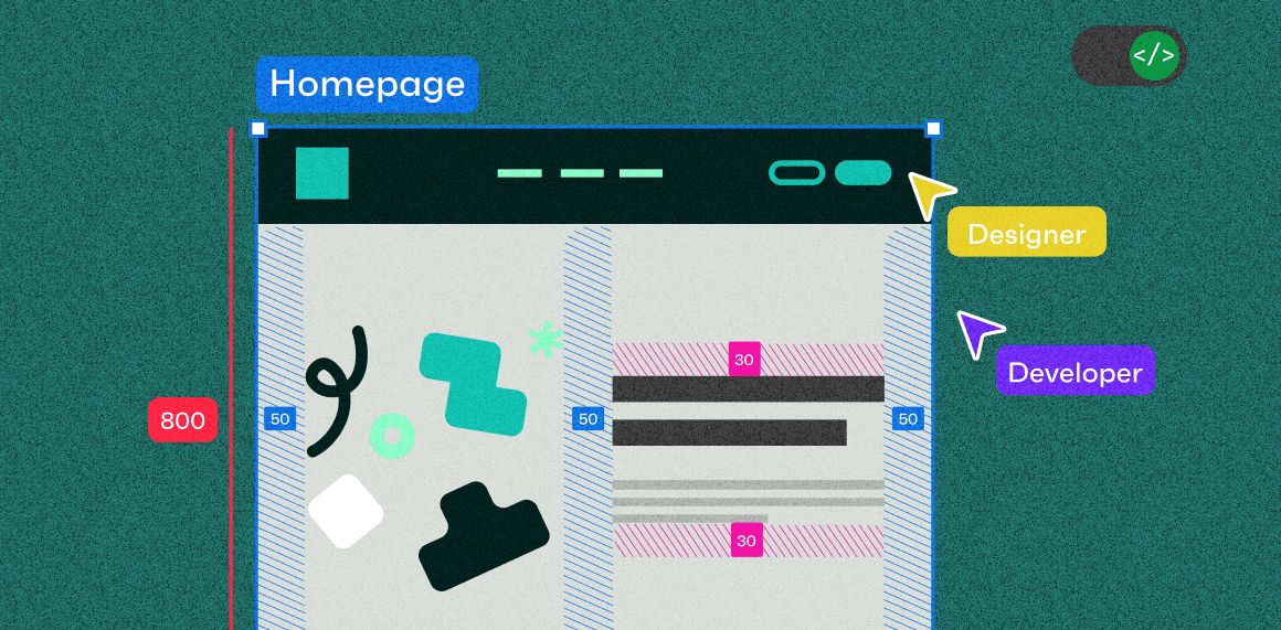
When we design products, we start with questions like: What does it look like to the end user? How will it work? What’s the product's first impression, and how does it connect to the brand? Designers need to consider many things when creating beautiful, functional interfaces.
Then, once it starts coming to life through code, inconsistencies start to become apparent, real content starts to create wonky looking layouts, and things that worked during the design process don’t follow the dev’s CSS systems. This can lead to frustrations for both design and development teams. But what if we could design and code using the same sets of rules and be better aligned from the start?
Why is it important for designers to think more like developers?
Here’s the thing: designers are not making these files for themselves - more and more we see developers, designers, and QA using Figma to collaborate and as a source of truth for UI/UX patterns.
(Last year, we even shared some lessons learned after using Figma in our workflows).
So, to think more like a dev, we need to remember that our designs (while functional and aesthetic) need to ultimately adhere to an underlying set of rules. You need to consider all states of components, including responsive, and how different amounts of content affects your components.
So, how does this change our designs?
Here are some things to consider within your designs:
Auto-layout for easy responsive
Show all variants of your components
Don’t forget about the unhappy paths!
Team walkthroughs
Create tokenized design systems
A well-defined design system gives you all the legos you need to assemble designs and keep them working as intended. As a designer, you might have soft rules, like using a specific blue colour for all action buttons, and a different colour for titles.
Developers don’t have that list of soft rules when you pass the designs to them (and really you shouldn’t either). Instead, try to establish a system of how colours are used:
Create a tokenized design system with semantic naming so each colour/value is associated to how it's being used. This makes it easier for everyone to understand.
A tokenized system allows developers to reference and update colours in the codebase easily.
It’ll also reduce the chance of having one-off values or inconsistent usage.
An example of a tokenized colour 
An example using semantic colours 
💡Some resources on setting up variables and a tokenized system:
Auto-layout for easy responsive
Figma’s auto-layout feature is a game-changer for creating flexible and scalable designs. Outside of being super helpful at adjusting components automatically based on their content, it makes it easier for developers to translate your designs into code since it needs to follow a set of spacing and alignment rules.
Creates more consistent spacing/padding: Use auto-layout to define consistent spacing and padding across your design helps ensures a uniform usage
Easier to update: add or remove content and components from your layouts without breaking it
Test Responsiveness: Continuously test how your components behave with different content lengths and screen sizes. This helps you catch potential issues early and ensures a smoother development process.

💡It does take some time to set up initially, BUT it’s well worth it in the end. Here are some resources to help you set up auto-layout if you haven't tried it yet:
Show all variants of your components
Its hard to see the whole picture when you only have a narrow view, similarly showing only some of the states of your components doesn’t account for all the functionality that will need to be considered when they go into development.
If you’re leveraging an existing design system then all the pieces and states are usually there, but even still often those atomic components get combined into new blocks or components, and its easy to forget to build out all the various states. For example, hover states, inactive, different responsive sizes or with various types of content.
Think through all your states, and what are all the things that can affect this component, from content changes to different interactions types or responsive sizes.
Keep your patterns consistent, if you’ve used a hover state for an element elsewhere can that be leveraged for other components?
Sometimes it doesn’t make sense and a new pattern needs to be created, which is ok, just try to keep exceptions to a minimum.
Sync with devs on any new patterns or components to see if there’s anything you missed, they may have additional use cases in-mind.

Don’t forget about the unhappy paths!
We often design happy-path or ideal states first (of course we just want what’s best for our designs) but error-states, empty-states, issues with too much or too little content are all realities your designs will inevitably face.
So, similar to the above about considering all your variants, don’t forget about showing those states when things don’t go as planned, because your devs will have to.
Un-happy states like inactive/disabled states, errors states, error notifications, and even different levels of empty states and loaders
Its not all errors, could be reminders, prompts or other states that only get triggered by a specific event.
Error happens - what happens next? Is there an action a user should take, where should they go next?

Team walkthroughs
Despite all the notes you add, the detailed requirements you write and all the flows you show, nothing beats a personal walkthrough of your designs. Include the whole team, dev, QA, project managers, etc. This way the team can ask questions in real-time, you can collect feedback and you can all align on a plan to go forward into making these designs a reality!
Bring the whole team along for the kickoff/walkthrough - you can always schedule breakouts with individuals if needed
Hopefully there’s no surprises, the team has been connected along the way, seen your progress and this is really just showing how it all comes together in full
Building better, together
Designing like a developer doesn’t mean you have to sign up for a boot camp so you can dive into coding. It’s about making additional considerations when creating your designs so that its easier for your team to understand and implement.
This collaboration leads to a more seamless workflow, fewer revisions, and ultimately, better products. When designers and developers work together with mutual understanding of each other’s craft, it’s easier for everyone to take the product to the next step.
The goal is to create better digital products by closing the gap between design and development. So, we can unlock new levels of innovation, efficiency, and creativity. The more we understand each other's roles and work together, the more we can achieve.

